Taking the time to evaluate and critique your resume is vital to putting your best foot forward, and as we’re all at a pause, there’s no better time to do that than now. That piece of paper (or pdf file) becomes your first impression to designers, production managers, and other employers. But all too often, even starting to write your resume can feel like an impossible task. Even more so because there’s very little standardization of what they should look like for theatre. Sifting through websites with tips and helpful hints for a traditional, corporate-based structure can range from confusing to downright frustrating when you’re trying to apply it to a completely different world.
At its heart, your resume is telling a story. Where did you come from? What have you done? How have you progressed over your career? You’re just telling it in bullet points instead of prose. Anyone looking at your resume is trying to do a couple of things: they want to know what skills you have and what shows you’ve worked on, or people you’ve worked with, but they’re also looking for information about who you are and if you’d be a good fit for a team they’re building. Your resume gives them small indications of that based on its presentation: did you slap together a slipshod line of things you’ve worked on with your name pasted at the top? Or does it look like you took some time and pride in presenting yourself to potential employers?
Over the course of your career, you’ll end up with a couple different versions of your resume. When you’re first starting out and have less experience, you may include some details about what your jobs entailed, but once you’re established in your career, your resume neatens up and becomes a list of the shows you’ve worked on and what your role was. Even then, you still may have a couple versions to focus on different skills or shows: if you’re looking for design work as opposed to mixing work as opposed to production work.
For example, when I left college, I broke my experience in a few categories: Touring, A1, A2, Corporate, and Other Experience. It was busier than it needed to be and didn’t have much organization other than dividing up my experience. After working for a few years, my resume shifted to two categories: Touring and A1. That simplified things by getting rid of my college experience, starting to use sound designers instead of directors for shows, and formulating a better narrative. Instead of throwing every show, I’d done in the mix, I used my touring experience to highlight my progression from an A2 to A1, and selected certain shows I’d mixed off of tour to show that I’d worked at the same festival multiple years in a row (i.e. people wanted to work with me again).
Looking forward, if my goals shift to getting off the road in (likely to find a mixing-focused job where I could stay in one location), I would make a new resume that focuses on my A1 experience (including touring, sit-downs, festivals, one-offs, etc), and pushes my A2 work on the road into a less prominent category.
When you start writing your resume, it helps to break it down into manageable chunks. In my experience, most resumes have four general categories: Identifier, Experience, Skills/Education, and References.
- Identifier: Your name and contact info. It might also include if you’re a union member or have a website. Make sure that your name stands out on the page. The entire point of having someone read your resume is so they’ll start to know who you are.
- Experience: What places have you worked, positions have you held, shows you have done, etc. Your “story” portion.
- Skills / Education: These can be two separate categories or one with multiple sections. If you’ve recently graduated, these will sometimes separate with Education at the top of your resume, and Skills after your Experience.
- References: Who will vouch for you.
Typically the hardest part of a resume to write is the Experience category. While your name, contact info, education, and skills are cut and dry lists, here you have to look through your jobs and sort out which ones you want to use. To help, start by asking yourself what story you want to tell:
- Where are you coming from? Your resume will look different depending on where you are in your career. My jobs on tour don’t need explanation other than if I was the A1 or A2 because most people reading my resume are familiar with the job responsibilities of those roles. However, if you worked at a theatre where your official title was “Audio Supervisor,” but your job included designing, mixing, A2-ing, etc, it’s helpful to include that. Giving additional information on a job can be helpful if you’re at the beginning of your career and have less experience to put on your resume. Be clear and concise (i.e. lean towards bullet points vs sentences) and make these things the first to go as you work more and can streamline your resume.
- How have you progressed in your career? Did you climb the proverbial ladder from one position to another? Have you consistently worked your way up to bigger and bigger shows? Your resume should help showcase not only what you know now, but how you’ve grown in your professional life.
- What are you looking for? Tailor your resume to the job you’re applying for. If you’re applying for a mixing position that highlights your design experience, you’ll want to create a new version of your resume that focuses on the relevant skills.
- Don’t discount “Other Experience”: Any work you’ve done is valid experience. Non-theatre or non-sound related jobs can display a wider range of skills and shouldn’t be completely ignored. It won’t be the focus of your resume, but can absolutely be included.
Once you know what you’re going to put in your resume, here are some overall notes to keep in mind:
- Keep everything clean and concise. More often than not, your resume will be skimmed rather than read, so make sure information is clear and easy to find.
- Include when you worked on a project. Context of when and how long you worked on something is important. Your most recent experience should be first in any section, then older from there.
- Stick to one page. That’s regarded as a norm, and most people have strong feelings on adhering to it, so better safe than sorry.
- Make it a PDF. If you’re emailing a file, your resume should always be in a format that cannot be changed, so you know exactly what the end-user is going to see.
- PROOFREAD! Double and triple check your resume for spelling or grammar errors, to make sure your contact information is correct, and for general presentation (like having an extra blank page in the pdf file).
- Be honest about your skills. You can always say you’re “familiar” with something, but there’s a difference between having seen software open on a computer once and actually having used it before.
- Don’t go overboard with designs. The focus should always be on you and what you’ve done. Not the crazy font you used because it was “eye-catching” or a giant graphic design decal that draws focus away from the actual resume you’ve written. Fonts, colors, and lines are useful tools to differentiate sections or draw attention to specific items, but try to limit them to the headings, and don’t let a tool become the focus of the page.
- Don’t be afraid of having some blank space on the page. Aesthetically, cramming every single thing you’ve ever done on to the page will make your resume seem messy and difficult to read. Choosing to create space on the page can help emphasize important information (think: your name) and lend additional clarity to your organization (putting an extra space between two sections to help the reader register that they are separate, or making lines 1.5 instead of single-spaced so your eye has an easier time reading).
Finally, references. This can be the most important category of your resume. A first-hand account of your abilities and work ethic from a trusted source has more influence than any words on a page. This is another area where you can choose to personalize your resume on a job-by-job basis if you have mutual acquaintances with the reader.
When picking a reference, it depends on your job. If you’re a designer, you want to choose directors or other designers you’ve worked with. As an A1 or A2, use designers, associates, or production colleagues. (I’ll use resident directors or music directors as well, but it’s better to prioritize other sound people first.) A2s can also use their A1s.
Always ask for permission before you include someone as a reference. It’s the polite and professional thing to do as well as letting them know if you’re sending out resumes, especially if they might get a call. In the age of telemarketers and spam phone calls, all of us default to ignoring unknown numbers.
You should always include your references. There are a couple of exceptions to this: if you’re sending resume-blasts out to a variety of potential jobs, or if you’re posting your resume online in a public forum where your reference might not want their personal contact information displayed.
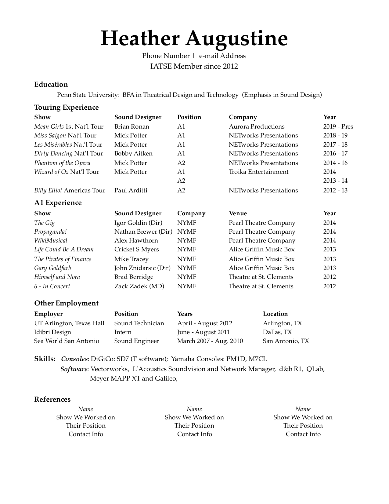
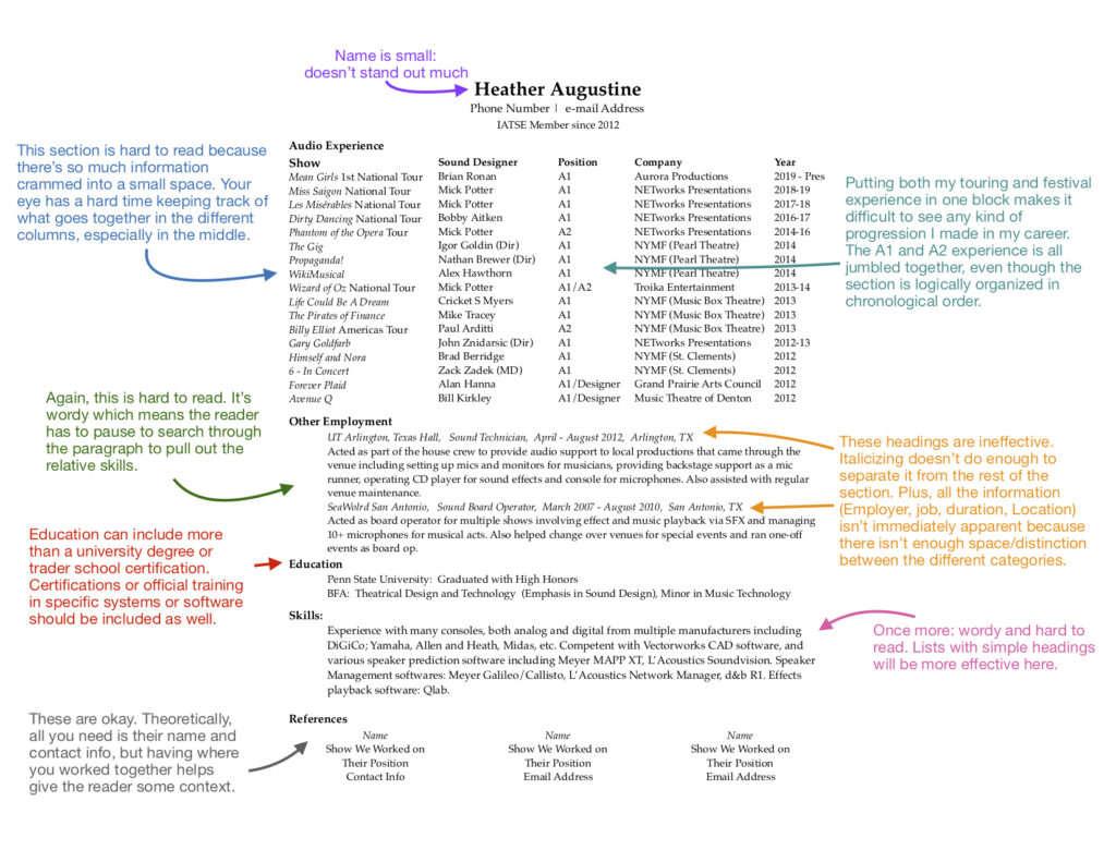
So, let’s take a look at a not-so-great resume:
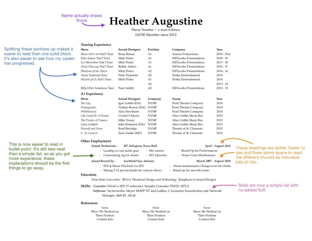
And if we make some edits:
And this is what my actual resume looks like. “Other Experience” is simplified down to a list, and it’s simple, concise, and easy to skim:
Once you have a resume written, always double-check for typos, inconsistencies, etc. (Then have a friend check, or two or three to be on the safe side.) This is something you’ll constantly add to and change as you progress in your career. After doing research for this post, I went back and made several tweaks, and that was a resume I’ve used for several years. Eventually, your reputation may proceed you enough that you don’t use your resume as much, but until then, make sure you make the best first impression you can.


